The role of design elements in making your home function-driven
Nov 19, 2021
27 min
Discover the emotional power of design elements that drives one’s home to function effectively.
This quote was a famous statement by Arts & Crafts Visionary William Morris. While it has already created a significant impact in the industry, particularly through his student Frank Lloyd Wright, who expanded on the idea "Form follows function," it became even more meaningful fast forward to 2021 because of the month-long lockdowns that have been implemented in the previous year. Every home in 2020 has become a version of one's office, classroom, cinema, gym, and many more. However, not all homes are tailored to function like those places, thus making most of us rethink our house designs.
"How can your home office make you feel like working?"
"Can your patio make you celebrate life's goodness?"
"What can you do to transform your kitchen and dining area to stimulate appetite?"
"What design best fits your closet to make you feel ready and energized?"
All these questions will be answered as we share with you some elements of design and how they could be perceived. By the end of this article, you already know which elements perfectly suit certain parts of your home for those areas to function effectively.
Elements of design
In our art appreciation class back in the day, most professors taught about the seven elements of design-- color, form, line, shape, space, texture, and value. These elements must be carefully considered in planning any design, particularly a premise's interior. However, in this blog, we have chosen to expound on elements that we think will be more useful and familiar: color, lines, and shapes.
Visual artists use these elements to achieve their goal of expressing their emotions or conveying a message to their audience. We can use the same elements in designing different parts of our home, but it is with utmost importance to be familiar with the impact of these elements. Let's have the first element, which is color.
Moods associated with the color
Take a look at the list below to know the moods associated with different colors.
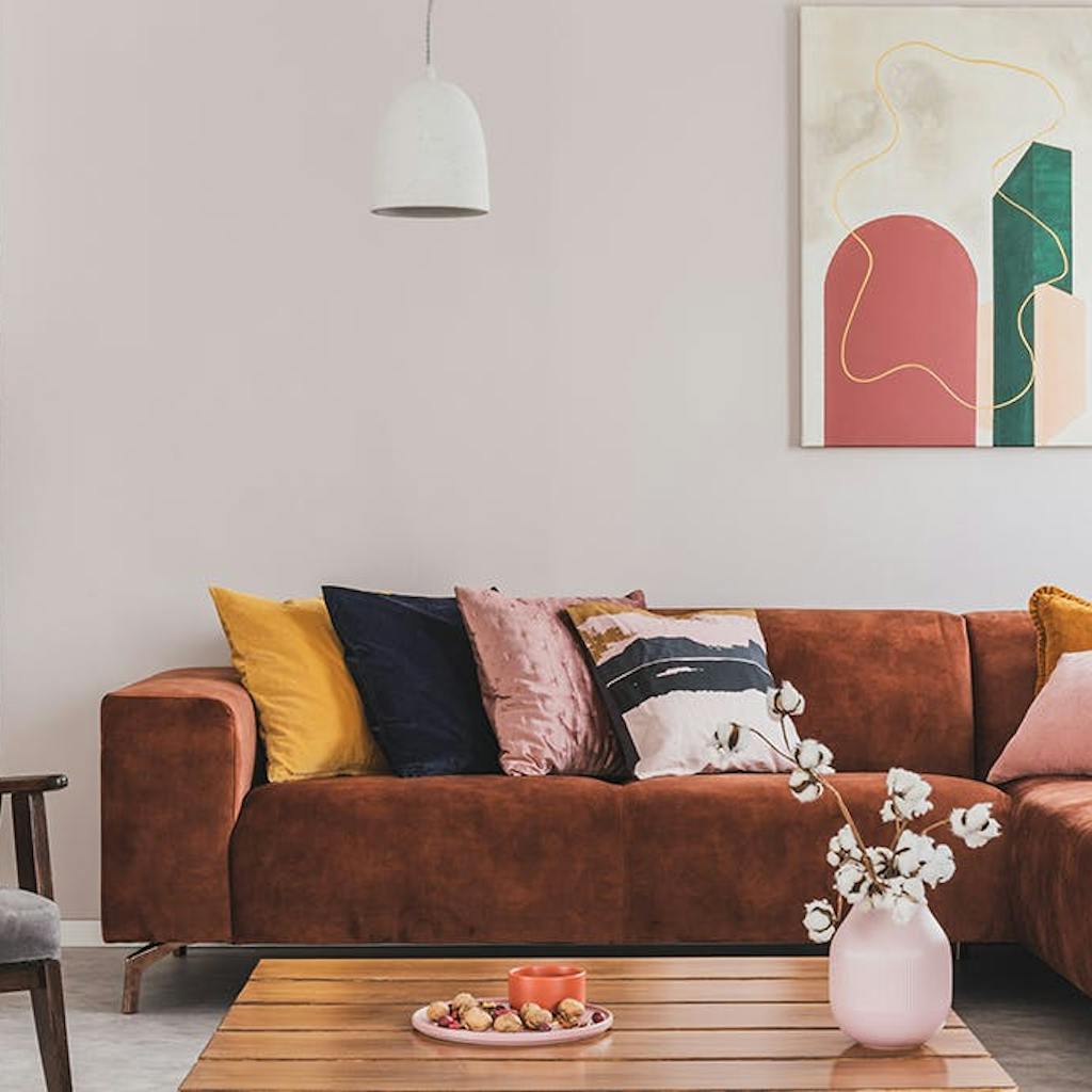
Red
If you want to stimulate vibrancy, excitement, appetite, or desire to take action, choose red. Check the photo of the living room below for a sample.
Orange
This color is known to bring creativity, energy, and spurs youthfulness and enthusiasm. Like red, orange stimulates vibrancy and fun. According to the site, BourneCreative, the orange color can do a lot. It helps in decision making enhances happiness, confidence, and understanding. It also stimulates mental activity and increases oxygen supply to the brain, which helps improve cognitive function in the elderly. Take a look at the sample bedroom below and see how it impacts you.
Yellow
A happy and youthful color that exudes hope and positivity. Helps increase one’s focus and allows one to make quick decisions. However, yellow has negative impacts too. According to Carlson Wagner, former director of the Wagner Institute for Color Research, you should never paint a nursery room yellow because it makes babies cry. At the same time, it results in shortness of temper in adults. See the photo of the living room below, for example.
Green
Conveys peace and safety.
This color incites balance and relaxation. Although sometimes, it depends on the shade, mint green, blue-green, or apple green works best. Consider the photo below to discover how relaxing the green living room is!
Blue
Signifies professionalism. Like green, this color generates tranquility and relaxation. It is known to create a feeling of security and orderliness. Best accent for the living room and bedroom. In addition, blue is also effective in the dining area if you're trying to lose weight. According to researchers, blue tends to curb our appetite and could even make us conscious with time. Take a look at the blue dining room below for an example.
Purple
Instigates sensitivity and compassion. This color encourages creativity and can be used to impress, as it is highly associated with prestige. Look at the photo below for the elegant living room it makes.
Be careful, however, to incorporate too much of this color because it could bring out qualities of irritability, impatience, and arrogance. Nonetheless, too little of this color could bring out powerlessness, negativity, and apathy.
White
Brings a feeling of cleanliness as it can clear emotional clutter and silence the inner critic. Encourages purity, so white is definitely best for any personality! See the photo below for inspiration.
Black
A color that resembles power, discipline, and elegance. Often associated with fear and mystery and can be used to intimidate and create an eerie atmosphere, just like the black accent living room below.
Brown
Incites organic feel and heritage. This color can be used to suppress emotion, create a wholesome feeling, and encourage connection with mother nature. It is also believed to give a sense of orderliness and convention which is best for office setup. Brown also makes one feel welcomed, so this color is also good for your living room. At some time, it is also believed to stimulate appetite, especially chocolate brown. The photo of the kitchen definitely fits this definition!
Gray
Like blue, this color encourages professionalism and formality. It can also spur practicality and conservatism. Some shade, on the other hand, may sometimes depress energy. Discover the impact of gray on you by taking a look at the photo below.
Gold
Because of its association with elegance, this color encourages a feeling of success. It is also known to make one feel bright and cheerful. It is believed that gold sharpens one’s wisdom and aids in health and wellness. Be inspired by taking a peek at the golden room below.
Silver
Conveys grace and elegance. Best accent for kitchen interior! Take a peek at the photos of the kitchen below.
Bronze
Since it is closely related to brown, having this type of color in your home also gives an organic vibe. Depending on how it was used, it could either make someone feel elegant or humble. Check the photo below for example.
Photo: Tina, @letsdothishome/IG
If you find this information about color interesting and want to find more about it, check out our previous blog about color tricks.
Moods associated with lines
The second element is the line. Lines, like color, have different types. Each type, along with the mood associated with those lines according to the site Artachieve based on C. Law Watkins’ book entitled, “The Language of Design,” is shared next.
Horizontal and Vertical lines
Stimulates calm and peace.
This line is often used by artists to create tranquil scenes. Use more of these lines in places where you want to rest and feel comfortable, like the living room and bedroom. A home office is a good area to exhibit these lines.
Diagonal lines
Used to instigate movement and life.
Artists associate this line with action for good reasons. Best for living rooms and areas where you want to feel more lively and dynamic, like the kitchen, home gym, music room, and the like. See the photos below for examples.
If you don’t want to use diagonal lines on your wall, try wall painting instead.
Roman arch
Exudes gloom and heaviness.
On a positive note, this line resembles dignity and seriousness. It's best for home office to stimulate concentration and desire to achieve efficiency. See the photo below for example.
Grief line
How does the lampstand in the picture below impact you?
Grief lines are known to convey sadness and a worn-out feeling. While sadness is inevitable, too much emphasis on it is not suggested. Thus, if this type of line cannot be avoided, make use of them in a manner that lessens the impact and combine them with other embellishments to exude an uplifting mood.
Upper hemisphere line
A line is used to convey positivity which can lift one’s spirit. Make sure this line dominates at least one area of your home. In the following photos below, these lines were exhibited by the ceiling and office area.
Upside down hemisphere
The opposite of what the upper hemisphere line does. It exudes melancholy, which tends to pull us downward. Try to observe the photo below and locate the upside-down hemisphere. Notice that even with the vibrant colors of the background, the photo appears to be wearisome. If you’re planning to have this type of line, plan it carefully. Good layering and the right accent can make a difference.
Tall pointed, gothic arch
This type of line is known to lift one's spirit like the upper hemisphere line as it prompts one to look heavenward. This line also inspires one to contemplate. Gothic arches are mostly observed in church architecture, but it does not mean you cannot have your own version of this line at home. If you're currently planning on your home reno, try to include this in your private space.
S - curve
This line is believed to bring a feeling of gracefulness. Incorporate more of this line in areas of your home which you think require some rhythm. Get some ideas from the photo below.
Which of the lines appeal to you the most? Which lines would you like to see more on your next home remodeling? Share your thoughts with us!
Moods Associated with Shapes
Last on our list is Shapes.
Like line and color, the shape can convey emotion which can impact the way your house functions. See the list below to discover.
Circle
Resembles luxury and abundance, and exudes comfort. No wonder most living rooms are dominated by circle-shaped embellishments. Consider the photo below as an example.
Triangle
Portrays toughness which could sometimes stabilize one’s emotion. Best placed in areas where you need to focus or places where you often spend most of your time. Check how the triangles were incorporated in the example below.
Square
Square-shaped home decors and designs encourage purity and rationalism. Display them anywhere you want. Check the designs below for example.
Conclusion
Discussing these elements doesn’t mean that you should only focus on them. Artists blend several elements to convey a message to the viewers of their artworks. Think of yourself as one of those artists. What message do you want your future self to get once your home interior is done? How can you or your general contractor/renovator make these elements function effectively to create that relaxing ambiance in your living room or stimulate overflowing energy whenever you spend time with your gym equipment?
Are you a go-getter who wants to feel a sense of readiness whenever you spend time in your home office, then maybe you can opt to paint your room yellow or orange and then blend it with furniture that exhibits diagonal lines or maybe objects that are circular shapes just like the photo below.
Or maybe, you want the other way around, calm and rational. If you do, trying wall paintings in hues of ocean blue or tropical green is recommended. Regarding room accessories and furnishings, you may want to emphasize more horizontal or vertical patterns while utilizing more boxes and square-based home decor since these elements are meant to pervade a sense of peace.
We hope that your next home interior for your Clearwater property, Tampa, Lutz, and Dunedin will be function-driven and amazingly stunning with all these in mind. Carefully plan how you and your custom home builder, or renovator will incorporate the elements mentioned above to make them function based on the emotions you need whenever you want to go back to that corner of your home.
This post is the last part of the four-part series blog about interior design trends in 2021. In case you want to see which designs are included on our list, here’s the link to the first, second, and third parts. Thanks for reading!:)
This article was last updated on Jul 18, 2025
Share